- Learners can list the six elements of the data science lifecycle.
- Learners can describe the four main aesthetic mappings that can be used to visualise data using the ggplot2 R Package.
- Learners can control the colour scaling applied to a plot using colour as an aesthetic mapping.
- Learners can compare three different geoms (bar/col, histogram, point) and their use case.
Data science lifecycle & Exploratory data analysis using visualization
ds4owd - data science for openwashdata
2023-11-07
Other sources for help
- Posit Community Forum: https://community.rstudio.com/
- Documentation websites: https://ggplot2.tidyverse.org/
- Mastodon tag: #rstats
- Quarto GitHub Discussion: https://github.com/quarto-dev/quarto-cli/discussions

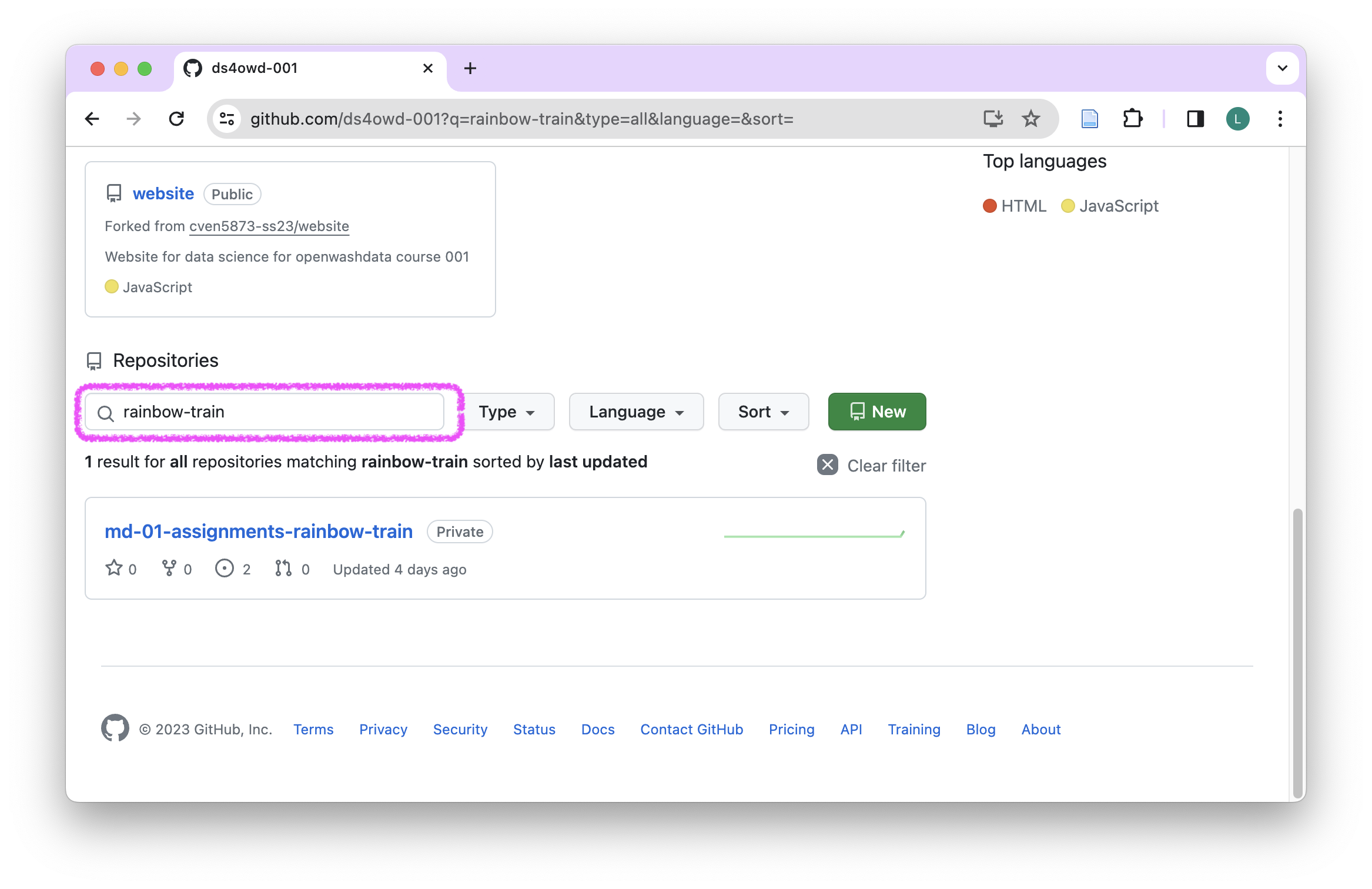
on GitHub Organisation
Bookmark this link in your browser!
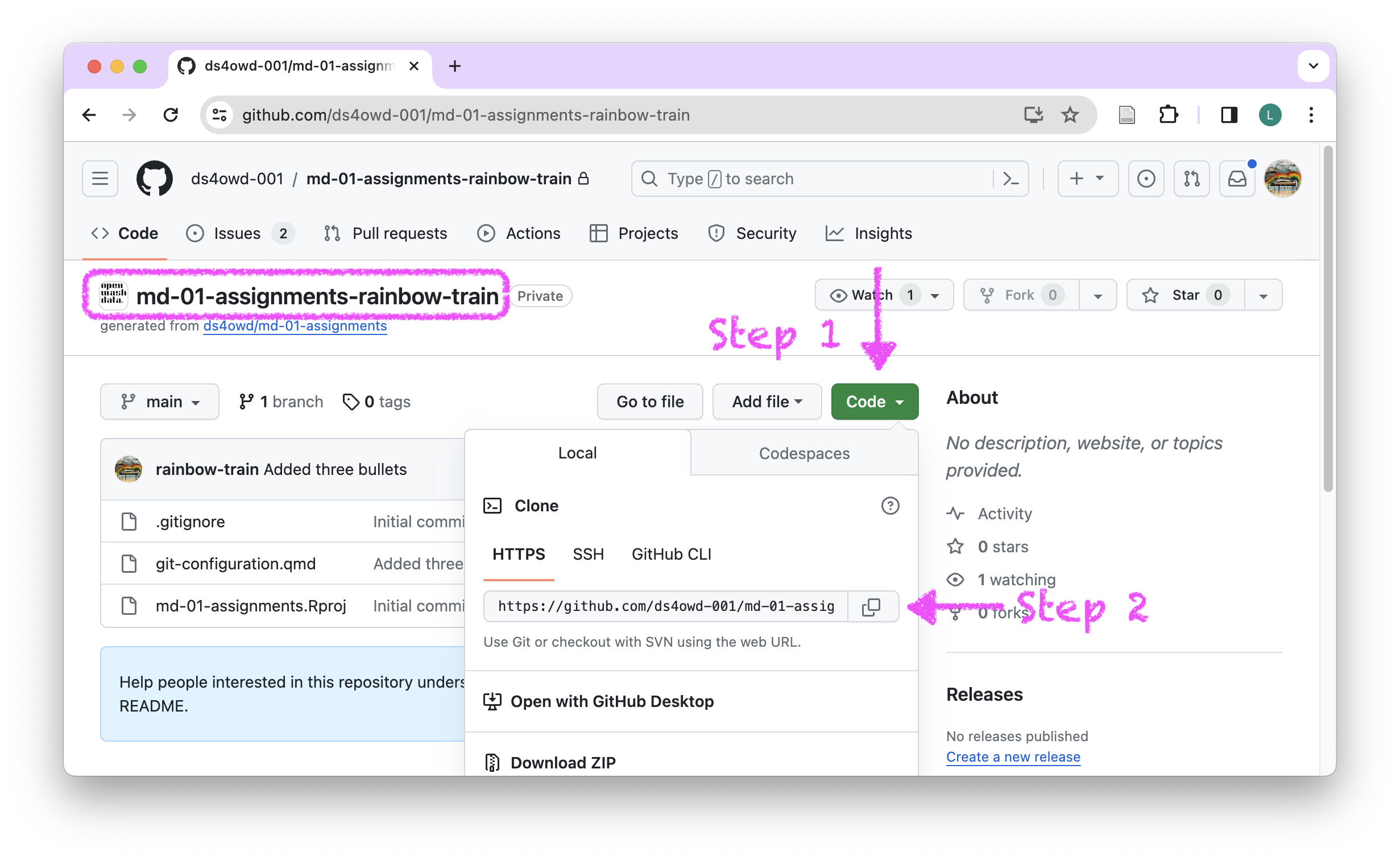
on your repository
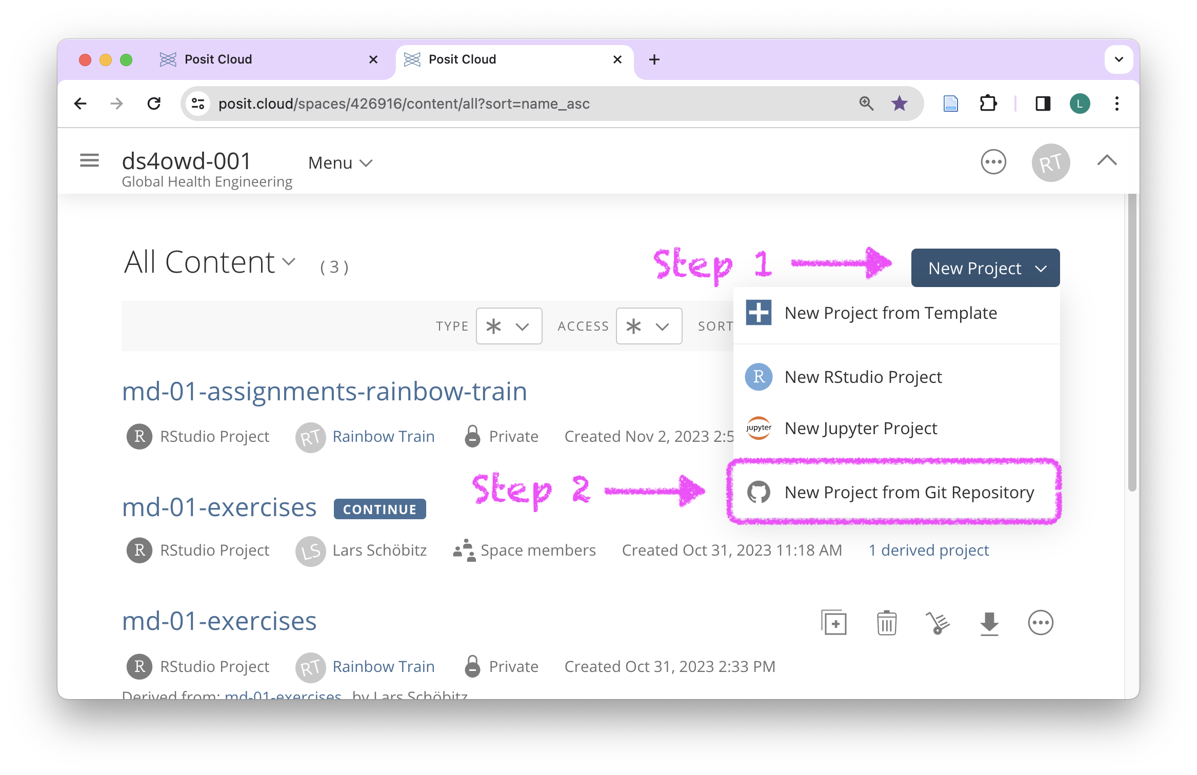
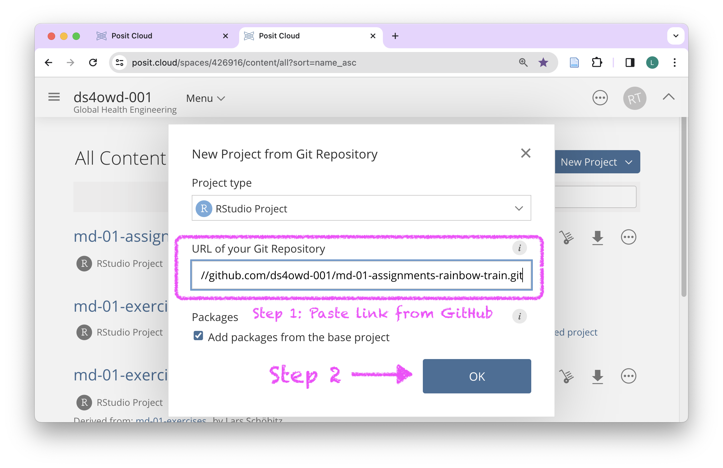
on Posit Cloud
Bookmark this link in your browser!
on Posit Cloud
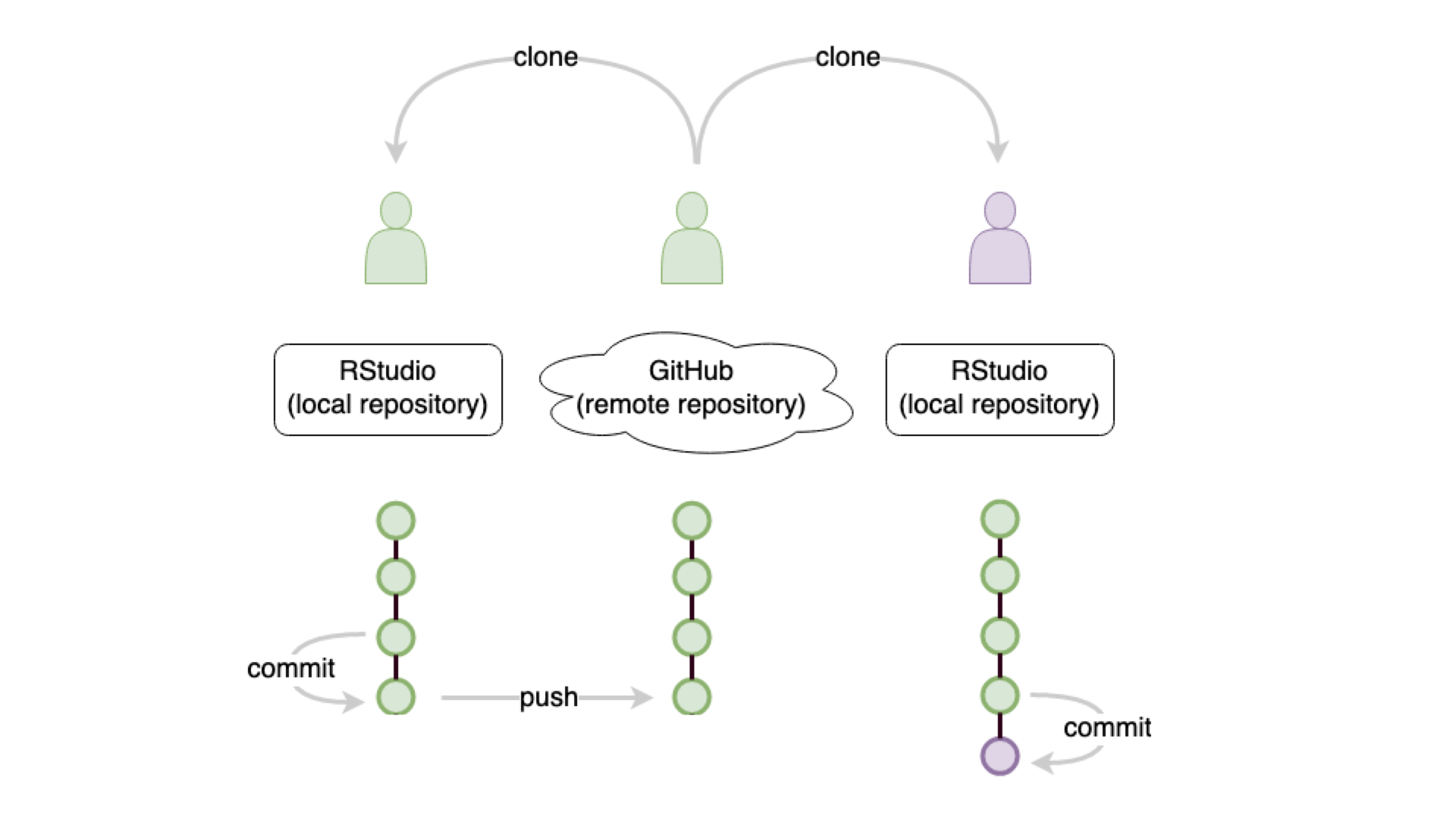
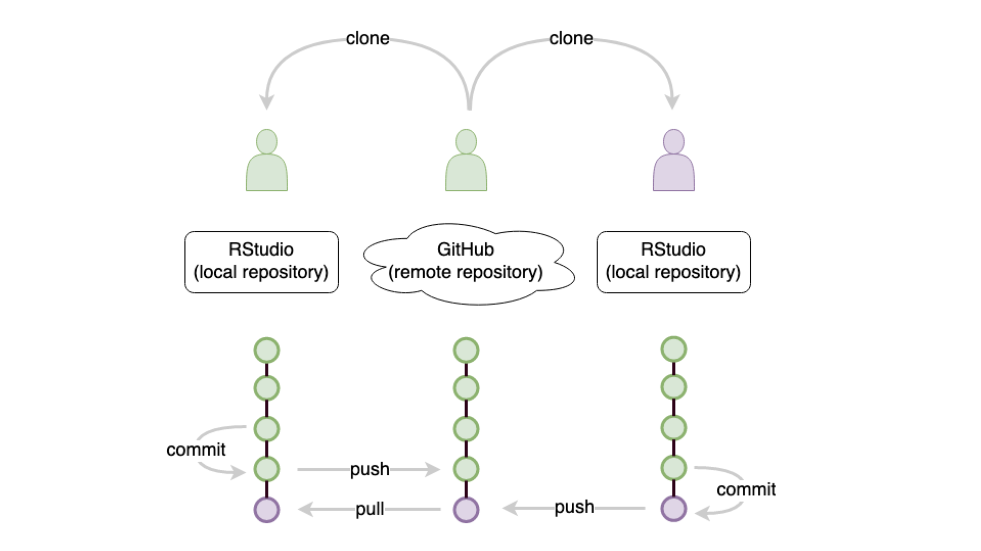
remember: git commit
remember: git push
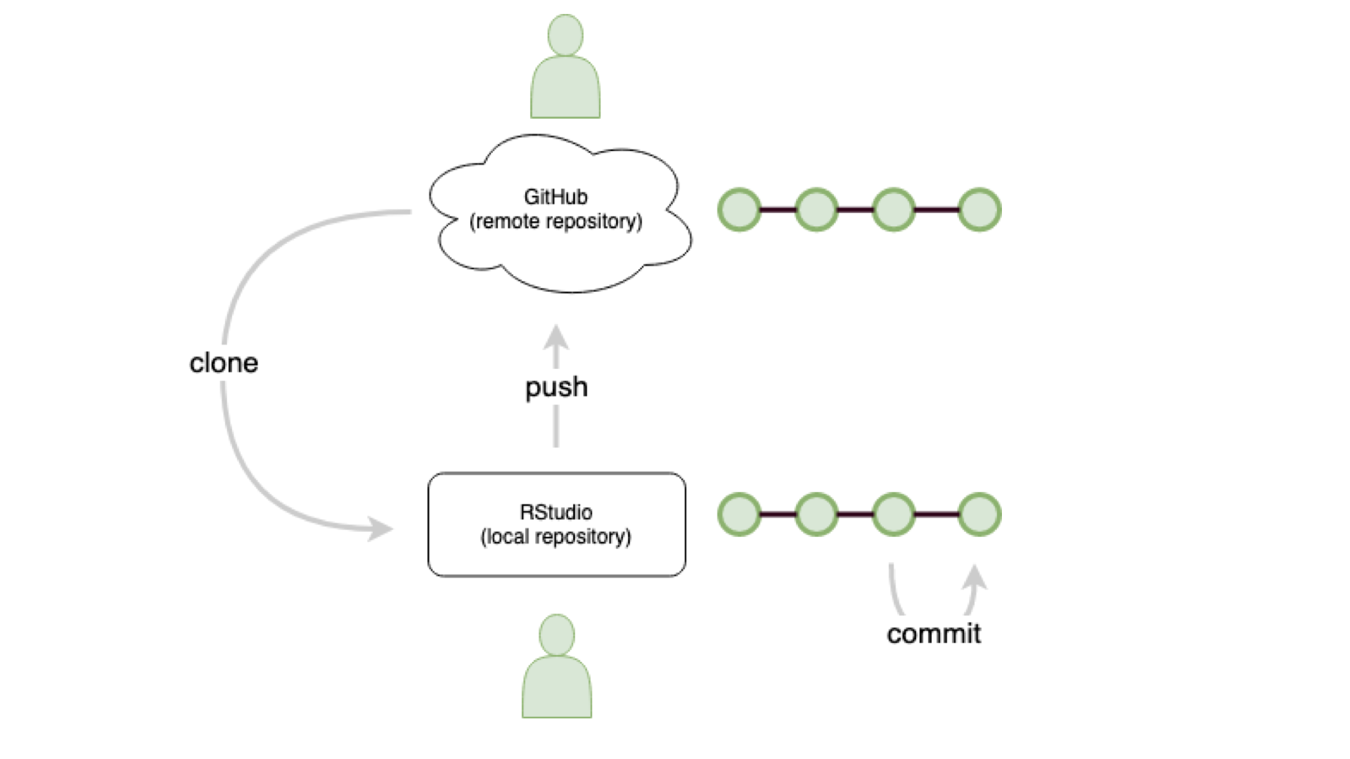
remember: git push
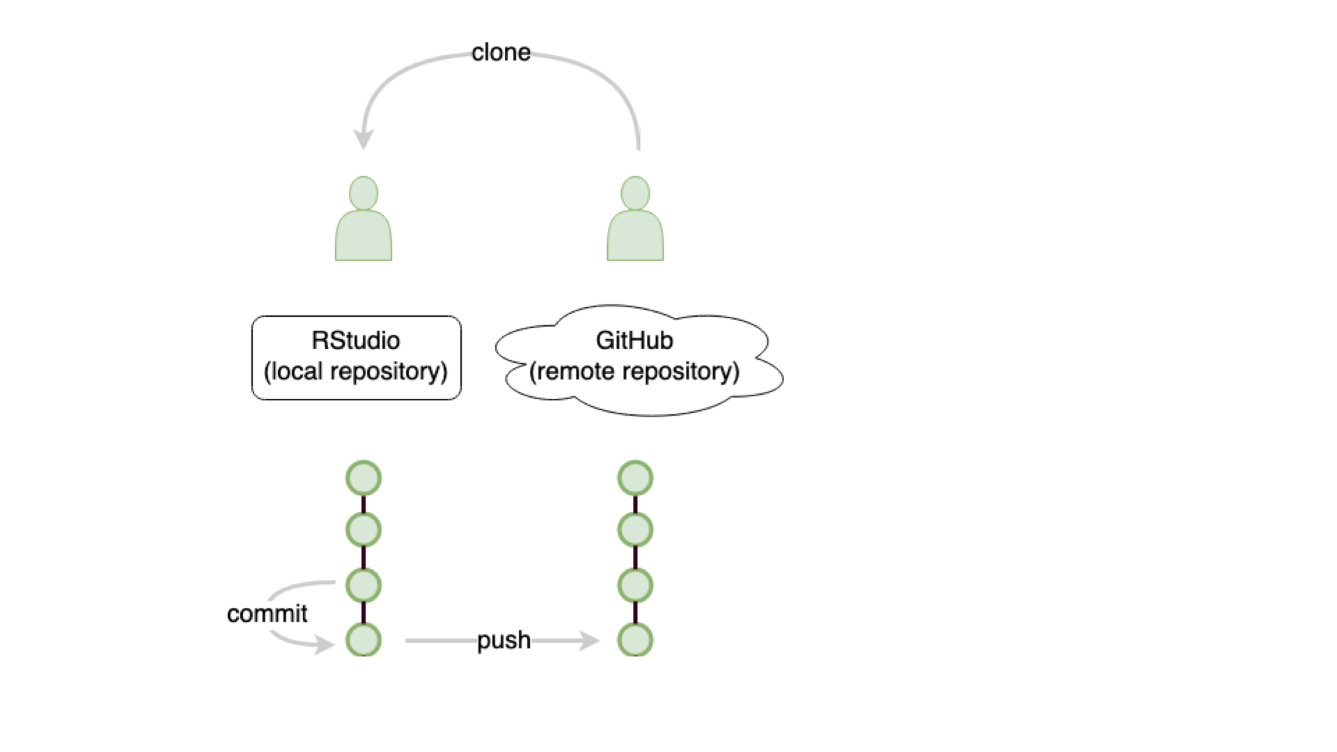
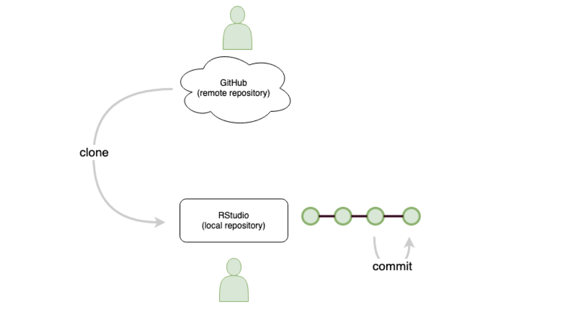
collaborate: git clone
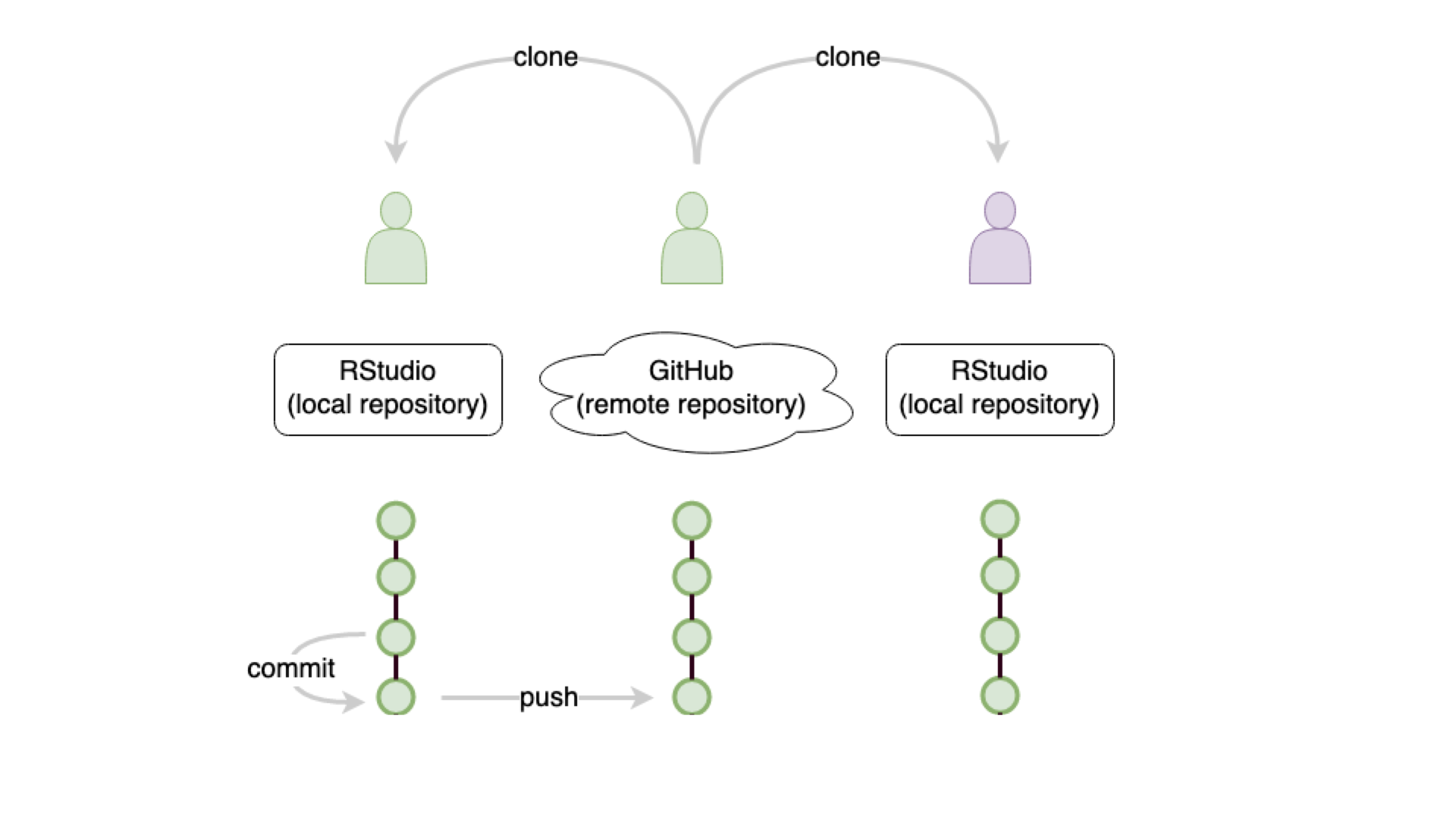
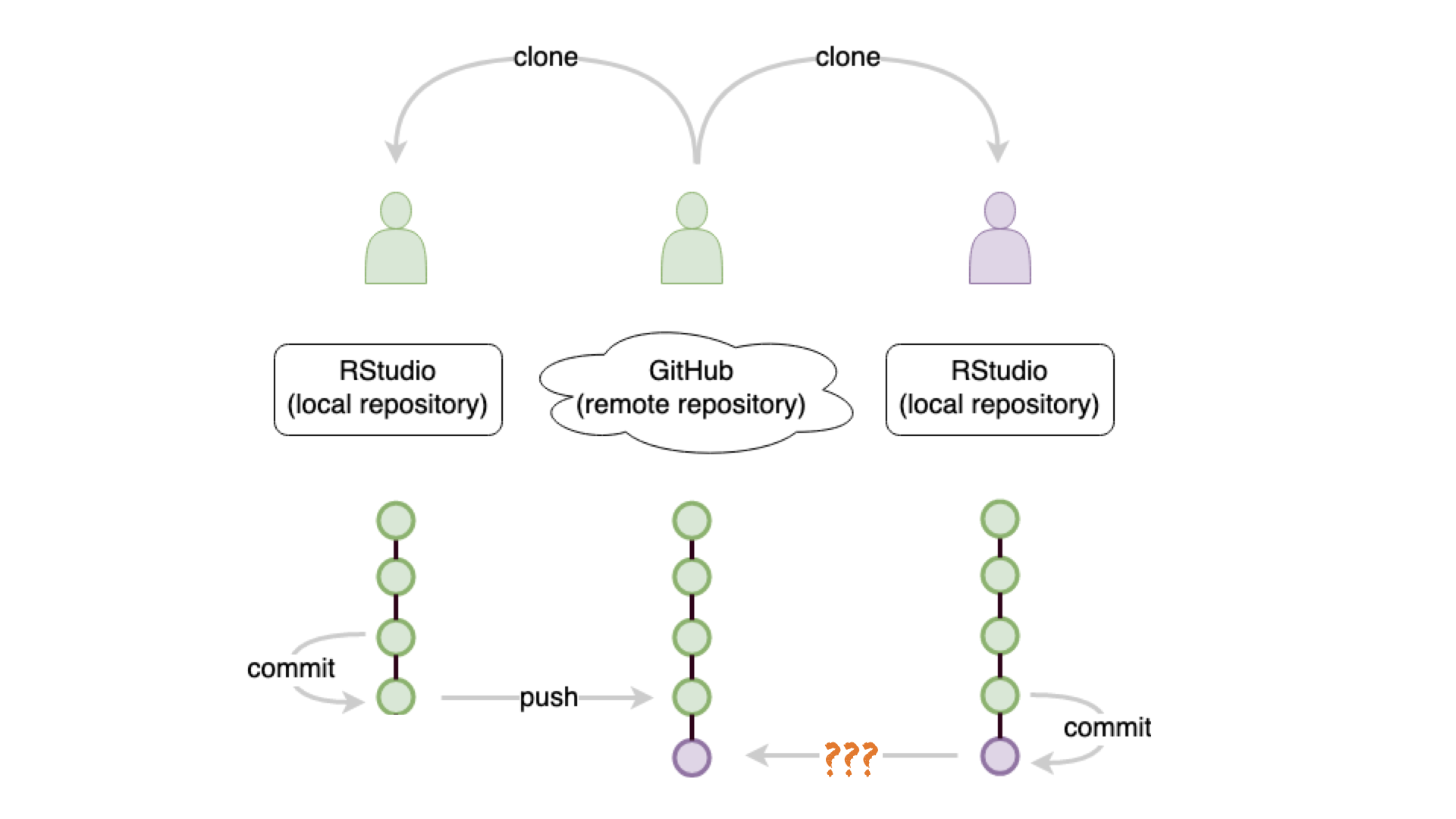
track work: git commit
update: git ???
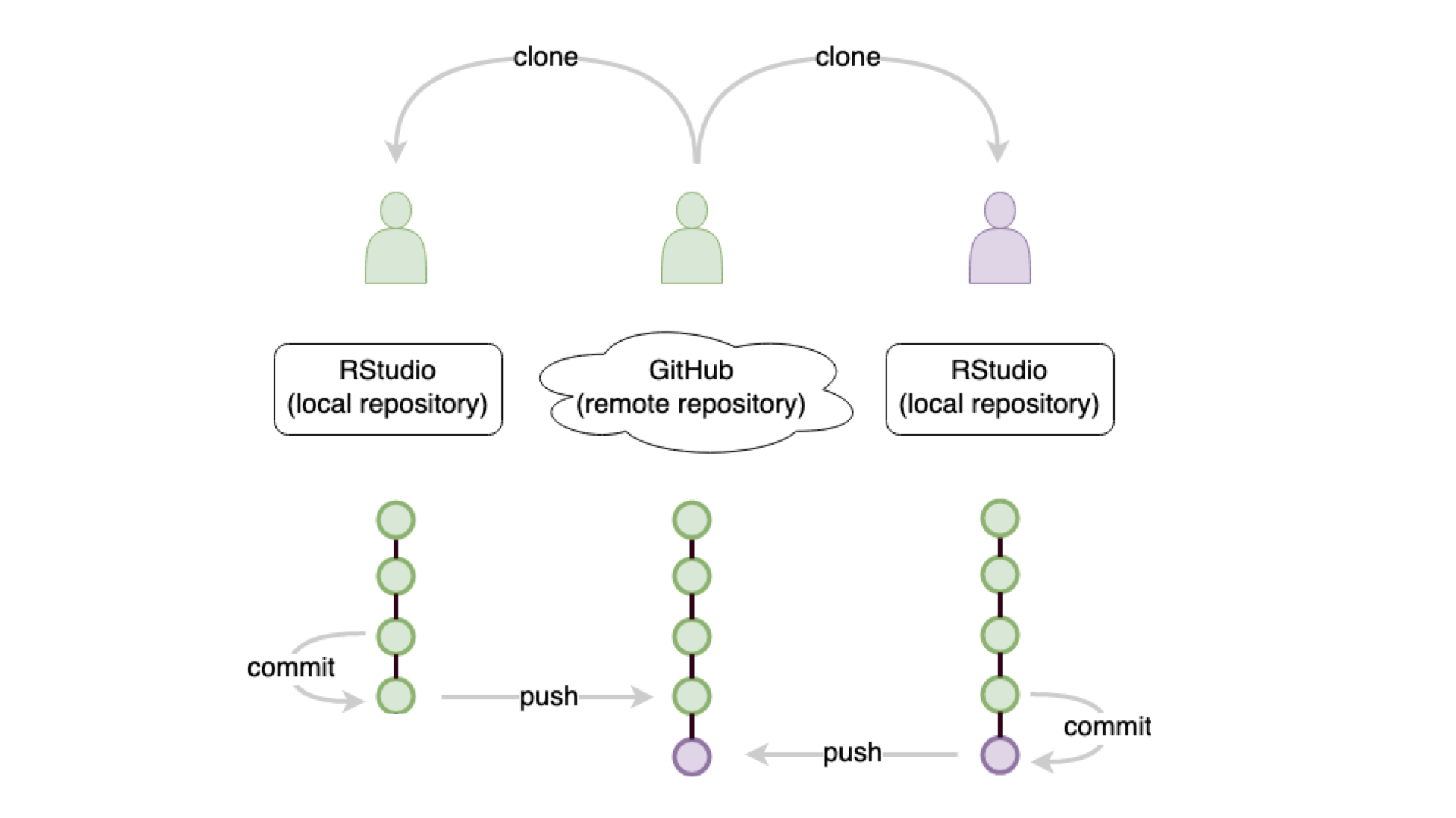
update: git push
git ???
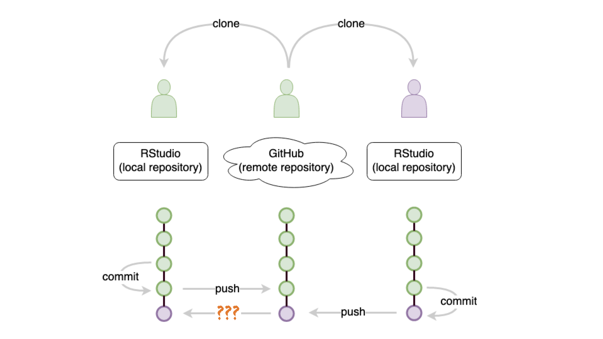
new: git pull
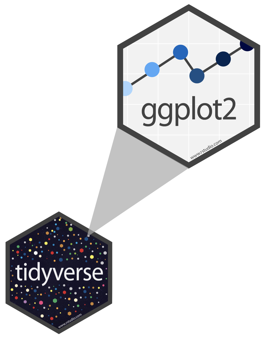
R Package ggplot2
- ggplot2 is tidyverse’s data visualization package
gginggplot2stands for Grammar of Graphics- Inspired by the book Grammar of Graphics by Leland Wilkinson
- Documentation: https://ggplot2.tidyverse.org/
- Book: https://ggplot2-book.org
Take a break
Please get up and move! Let your emails rest in peace.

10:00
Code structure

Code structure

Code structure

Code structure
Code structure
Code structure
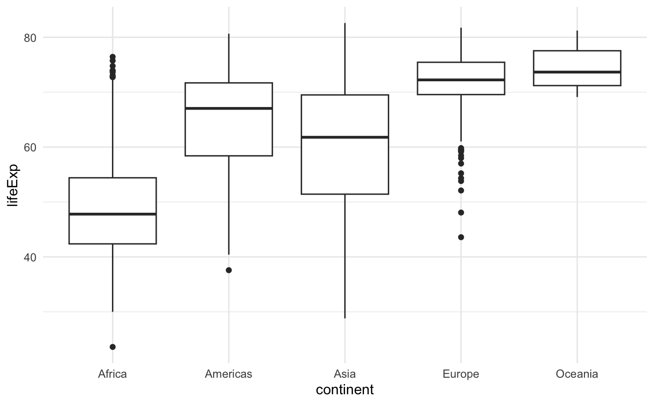
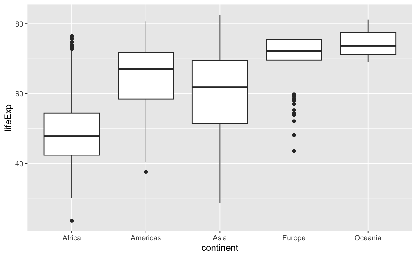
Poll 1: What does the thick line inside the box of a boxplot represent?
- the mean of the observations
- the middle of the box
- the median of the observations
- none of the above
Poll 2: What percentage of observations are contained inside the box of a boxplot (interquartile range)?
- 25%
- depends on the median
- 50%
- none of the above

Boxplot, explained
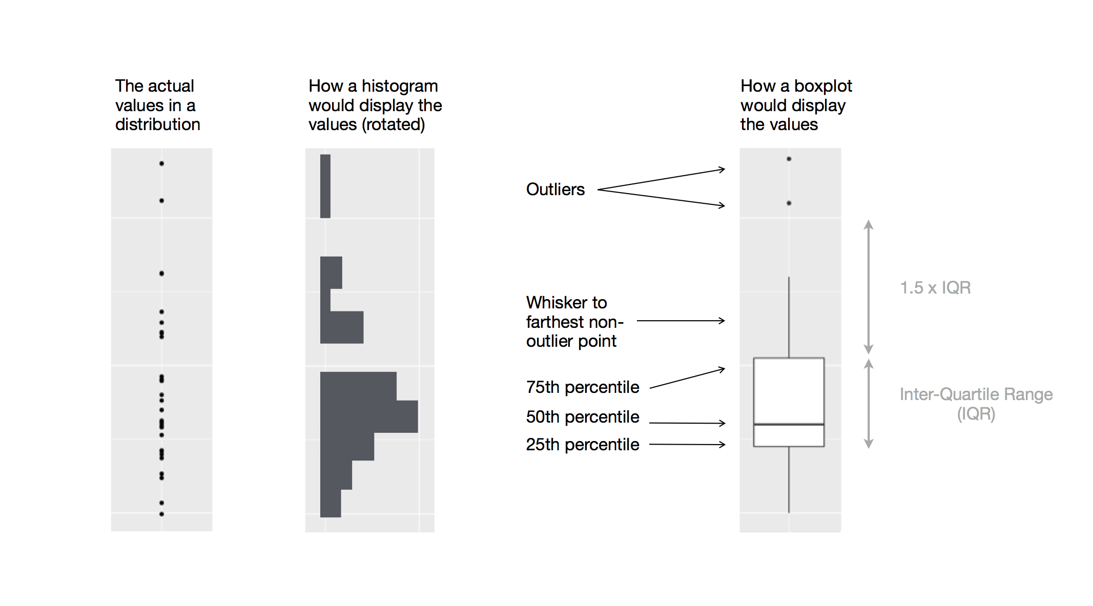
Figure 1: Diagram depicting how a boxplot is created.
Take a break
Please get up and move! Let your emails rest in peace.
10:00
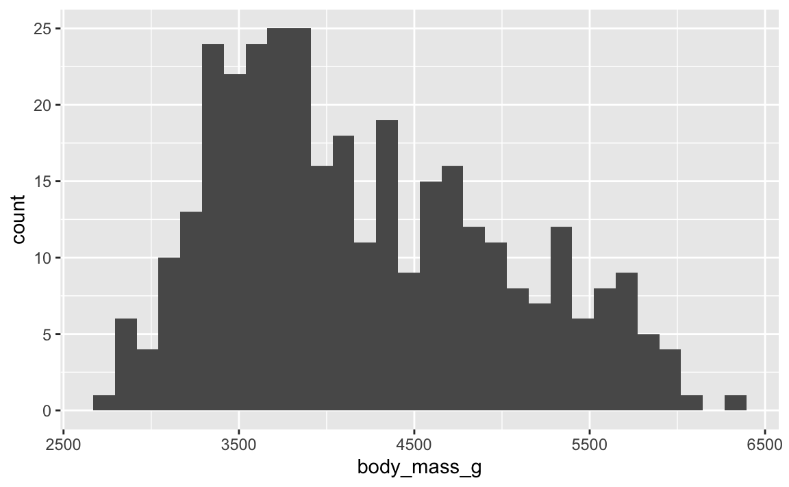
Histogram
- for visualizing distribution of continuous (numerical) variables
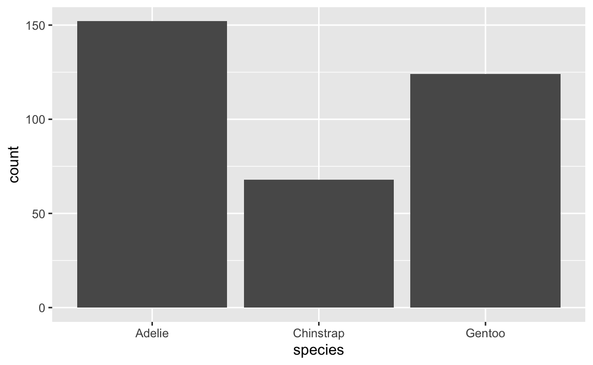
Barplot
- for visualizing distribution of categorical (non-numerical) variables
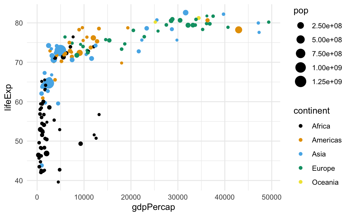
Scatterplot
- for visualizing relationships between two continuous (numerical) variables
Thanks! 🌻
Slides created via revealjs and Quarto: https://quarto.org/docs/presentations/revealjs/ Access slides as PDF on GitHub
All material is licensed under Creative Commons Attribution Share Alike 4.0 International.
![]()